
Interface · 2 September 2026
Design for the return visit first
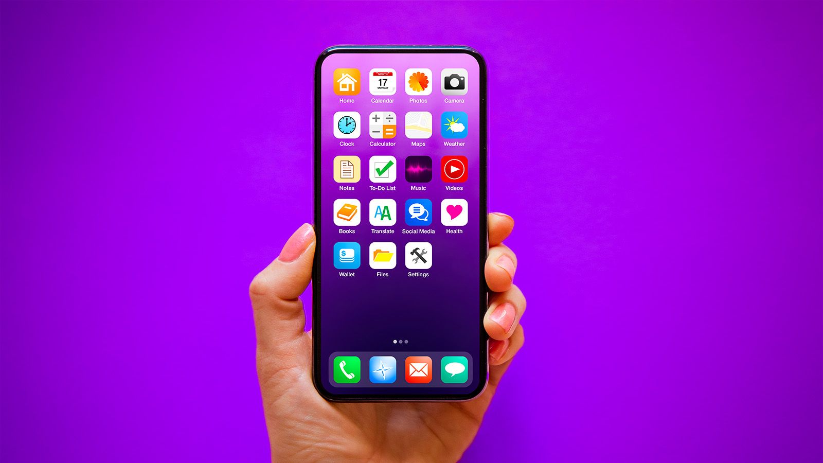
Product teams tend to spend the most care on a screen people see once: a welcome, a dashboard, a grid of everything the product can do. It's built for someone arriving fresh and wanting an overview. Most visits aren't like that. People come back to finish something.
I start from that return instead. What were they doing last time, what is still unfinished, and what is the one next step? An overview can still exist, but I don't make people walk through it to reach their work.
It changes the navigation too. I aim for fewer doors, with the one they used last still in reach. When a sidebar has twelve sections, it usually means twelve decisions were put off.
Company sites make the same mistake from the other side. The homepage tries to cover every service, and the visitor who arrived with one specific problem has to hunt for it. A page that answers one offer well and links to the next helps them more than a summary of everything.
If I can't say in one sentence what the first screen is for, it's probably a menu. Menus are fine, as long as they don't pretend to be the product.
More insights
- Design the failed login path firstEngineering
- Connect the model to a real systemAI
- Agree what a finding is before building the dashboardInfrastructure
- Use motion for state, then stopInterface
- Write the empty state before the full oneEngineering
- Leave a handoff the next developer can useEngineering
- Give an agent a boundary people can seeAI
- Build a company site for the next page, not the firstInterface
- Show the feed that stopped reportingInfrastructure